|
|
|
||||||||||||||||||||||||||||||||||||||
We’re going back to 1919, which almost puts us in the 1920s category - but of course everything changes when a decade rolls over, right? Typography, music, fashion, everything. The Plymouth Crier:
It was a Minneapolis store, and I haven’t found any other references. No doubt located on the ground floor, which underwent many changes over the years. A restaurant, a coal-company office, a drug store. Restaurant now. The building can be viewed here; it’s one of the venerable downtown blocks, but was stripped of its ornamentation after the war. It’s a hotel now.
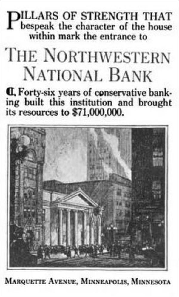
In 11 years it would move into its huge new HQ, which would later go down in a spectacular Thanksgiving Day fire. The bank eventually became Norwest, which became part of Wells Fargo. The site today:
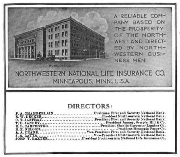
Another venerable Minneapolis name: Northwester National Life Insurance. The building on the right is the home office; the building on the left was a civic auditorium.
The site today:
It’s not as barren as it looks. The modern Orchestra Hall occupies the old Auditorium space, and the NWLI building was pretty dull: no loss. It moved into a much lovelier building in Loring Park.
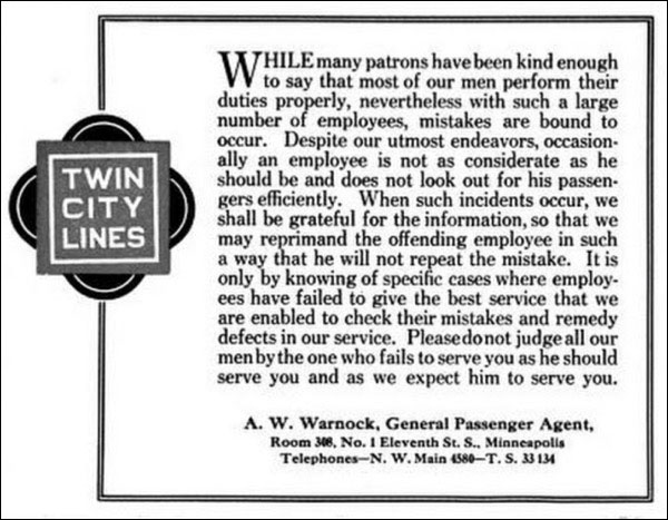
The Twin Cities Lines was the trolley company. Buses too, but they’re remembered around here for the streetcars. They ran the most talkative ads.
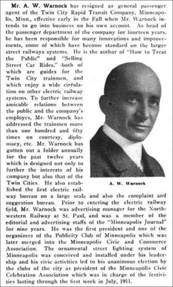
According to the Electrical Railway Journal, Mr. Warnock quit his job in July 1919 to start his own business. Electric Traction magazine has a better account of his career, with a picture!
He was the founder of the complaint bureau. So he took the surly motorman-matter seriously. He appears as a character in a musical play:
Prickly? I can see that.
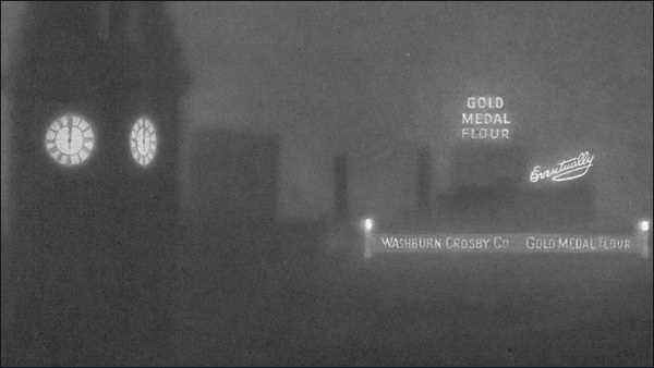
You may remember this from last July:
Yes, EVENTUALLY. The one-word ad slogan for flour. Just to remind you:
The ad says "Glad to see you all again" - a reference to wartime shortages?
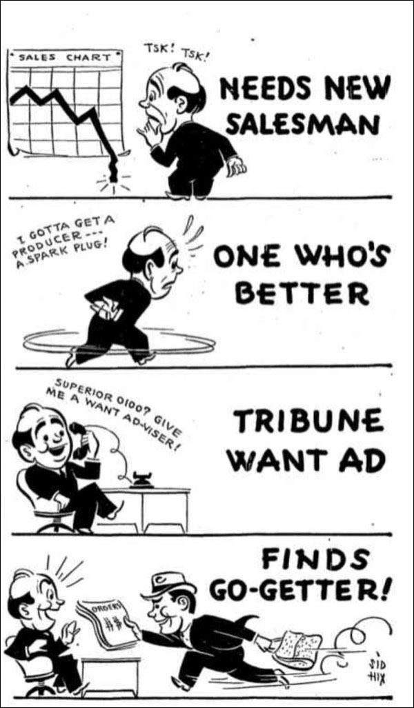
An ad for my newspaper’s want-ad section, back when such a thing contributed nicely to the bottom line.
The illo is signed, for once: Sid Hix. He did a lot of commercial illustration, and I don’t know if this was a custom job or something they sold to anyone who wanted it. The style doesn’t match anything else in the magazine - much cleaner and simpler. BTW, Hix turned out some books with “The Lighter Side of” in the title, predating Mad Magazine’s Dave Berg. I wonder if Berg got hte idea from Hix, or if it was just rattling around in general circulation. The collections of Berg’s work were called “Dave Berg Looks At. . . .” which suggests he might have known the title was something best left to its originator. Just speculation.
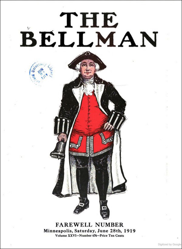
Usually this feature doesn’t do covers, but this is relevant.
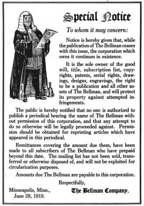
Farewell issue. We might be shutting down, but don’t think you can help yourself to our editorial content, bud - or skip out on your bills:
You’re reading the words of William Crowell Edgar.
Significant, widely-read, influential. And completely forgotten. |
||||||||||||||||||||||||||||||||||||||||
 |