
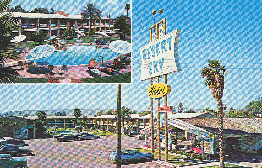
| DESERT SKY, Dothan AL | ||
 |
You don't read a lot about Font Mixing in the 60s, but it was rather common. Here you see the early 60s-style font on the sign, complete with googieriffic panels of perforated metal - and below, "Hotel" in a script that really doesn't go with anything else. And isn't that a motel, really? Of course. But by calling it a Hotel, and using a fancy-schmancy script for the word, you've elevated the place above its competitors . . . and justified charging a dollar more. Still there, but the sign was taken down for something that evoked nothing at all, except a yawn. |
|
