|
|
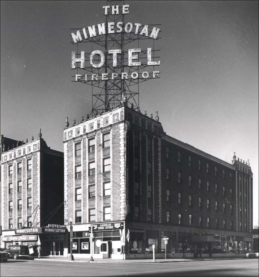
I’ve always had a soft-spot for the Ritz-Minnesotan. It might be the name – the Ritz is a classic hotel brand, of course, and the Minnesotan, its later incarnation, is a sturdy rebuke to them fancified Frenchy pretensions. Could be the sign – it’s just enormous. (Maybe it’s me, but “Fireproof” has that methinks-thou-dost-protest-too-much look.) The design was nothing special, but it held its corner well. Washington Avenue was a bustling street when the Ritz went up, and its days as flop-house row were still far in the future.
This picture dates from the beginning of the end, I think. The sign looks a little frayed; could stand some paint. It was still pitching itself as a respectable joint, though – this ad ran in 1956.
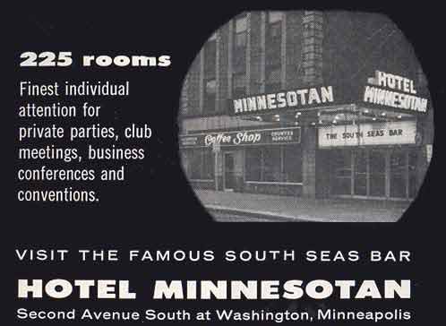
It must be modern! The picture looks like a TV tube!
Next: the early days.

|