This has a certain appeal. It shouldn't, but from this view, it's a fine post-war product, imaginatively hued.
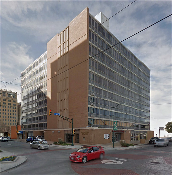
When would you say this one was built? Right: 1920. You can't tell from here, but the first seven floors have sunken windows, and the top five floors don't. That's because the bank was originally an nondescript but solid commercial structure from the early part of the century given a modern makeover - new floors and aluminum siding.
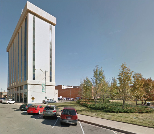
This stolid hunk of corporate modernism, Kansas style, replaced a hotel of the same overall shape - and that building was as boring a version of the era's prevailing style as this one.
Year: 1966. A dangerous year to build tall - fads were getting broad and banal, or just foolish. This one opted for dull.
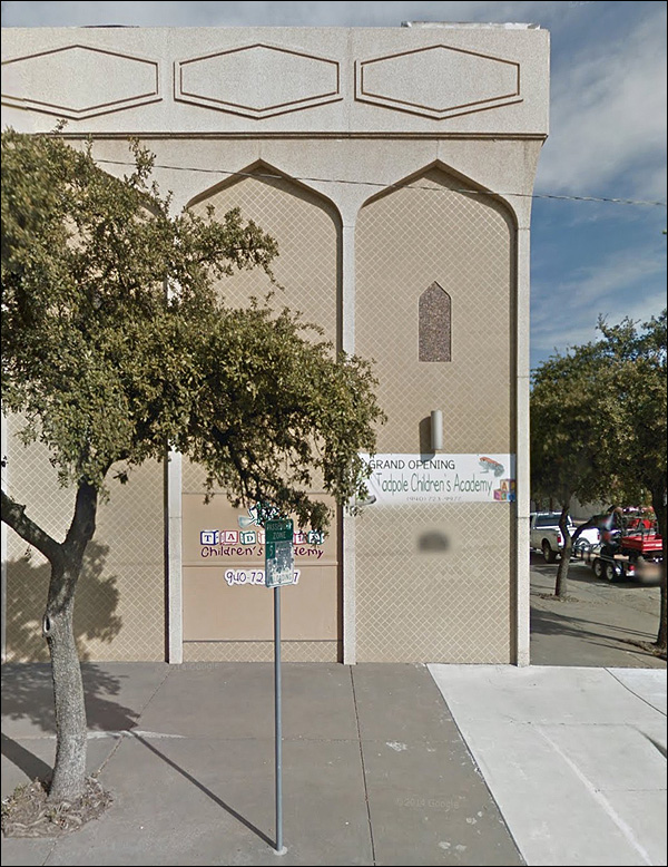
Speaking of faddish, foolish styles: let's have a Moorish revival!
No idea what purpose it could have seved; seems a bit much for a restaurant.
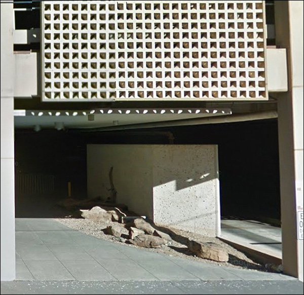
The inevitable end of modernism on the cheap:
Decorative rocks! A concrete screen! Dark threatening recesses. A city - on the grow!
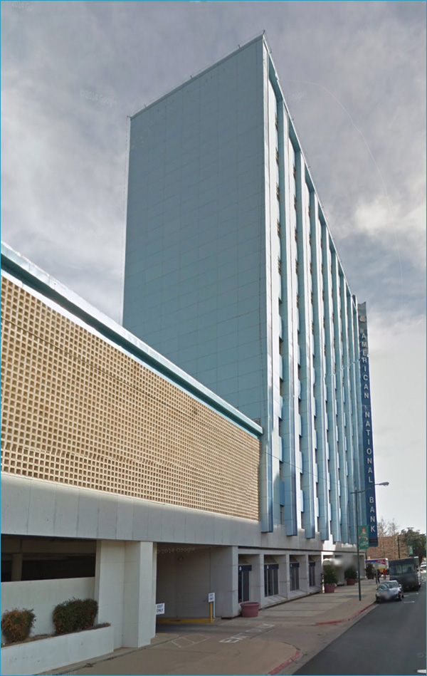
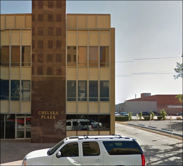
I've a fondness for the colored-panel school of inexpensive modernism. The hue of the marble completes the style. Very corporate:
The style gets no love, and perhaps it oughtn't, but some like would be overdue.
This is not how downtowns ought to turn out, but that's how it happens. Again, name the date the building was erected:
Correct! 1919. Huh?
The Staley building. White stone on the base, red brick all the way up, an elaborate cornice at the top. Mauled in 1982.
There's lots of old architecture in Wichita, and I don't mean to suggest it's all like this.
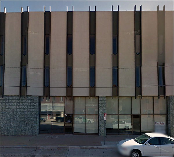
I'm just selecting the modern buildings.The thin slitty window phase may have summed up a certain skinny-tie Mad-Men ethos, but it made buildings look like jails inspired by computer punch cards.
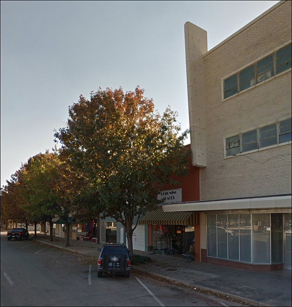
Oh, there are trees? It must be a vital, bustling place.
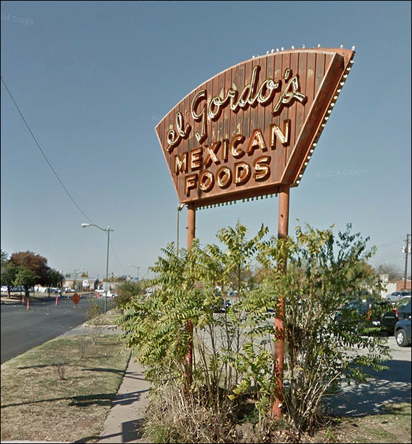
The building style reminds me of an old Woolworth's in St. Paul, but the style was rather common. The sign would tell us what it was, but it's had its tongue removed.
Abandoned signage:
And yet no one's stolen all the bulbs.
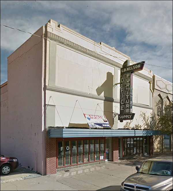
One final note - an old building whose rehab is older than the building was when they redid the facade.
Cities were better when such signs were common. Cities are lesser for their absence.
|
|||||||||||||||||||||||||||||||||||

|
 Is there any other city whose name sums up Midwesternness? Not Peoria; not Dubuque. Fargo is up there, somewhere, but Wichita, in the public imagination, is in the middle of everything. It's bigger than most of the cities this feature examines, but I was struck by some of the modern buildings. For good and for ill.