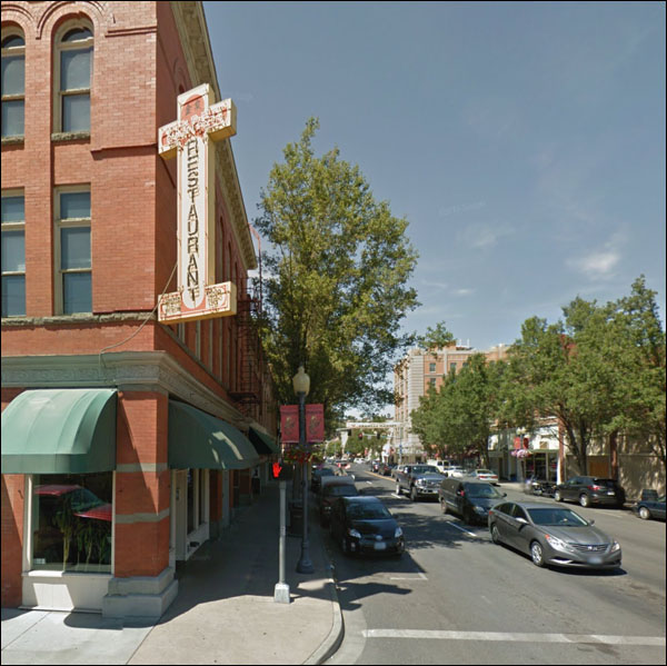
 One of the things I keep criticizing is the tree-lined downtown. There's not a single photo of old bustling downtowns that makes anyone say "that's certainly nice, with all the traffic and signs and people and stores, but it would be so much nicer if everythign was hidden by trees." One of the things I keep criticizing is the tree-lined downtown. There's not a single photo of old bustling downtowns that makes anyone say "that's certainly nice, with all the traffic and signs and people and stores, but it would be so much nicer if everythign was hidden by trees."
Doesn’t this look nice? Of course it looks nice. But.
Imagine the street without trees, and with lots of signs like the ones on the corner.
I am not opposed to trees downtown, but it's not the fix some urban planners think it is. Depends on the tree, how many, and where they are.

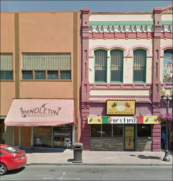
“Joe, I’ve just been to San Francisco. They call their brightly-hued houses ‘Painted Ladies.’ Want to try that here?”
“Sure. Say, let me show you this Miami Vice DVD box set I just got.”
They can’t see me they can’t see me I’ll hide here until they go -
“All right, old timer, come out with your hands up.”
crap
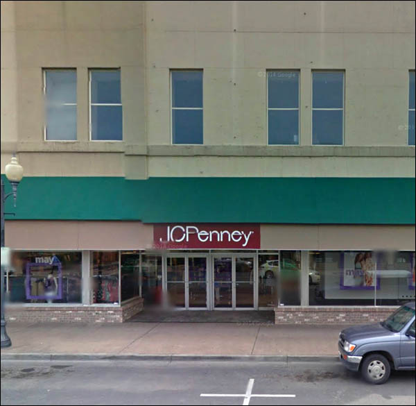
That’s unusual. Dull, but welcome. A Penneys, and it's open!
I suspect it’ll be closed the next time the Google car rolls around. Hold on, speaking of Google . . . yep.
Closed.
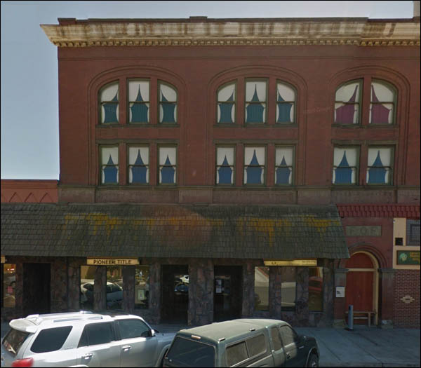
Something happened here - I can’t explain the top. It’s bereft of anything and there’s too much of it.
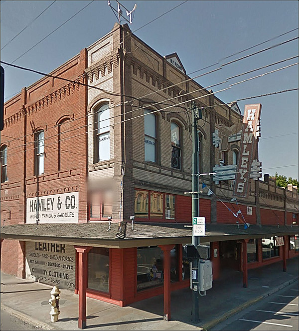
Yeeeee haw!
World-famous saddles.
There aren’t many saddle stories in urban areas anymore.
It’s something of a niche product.
Their website is like a clerk that comes right up to your face the second you step in the store.
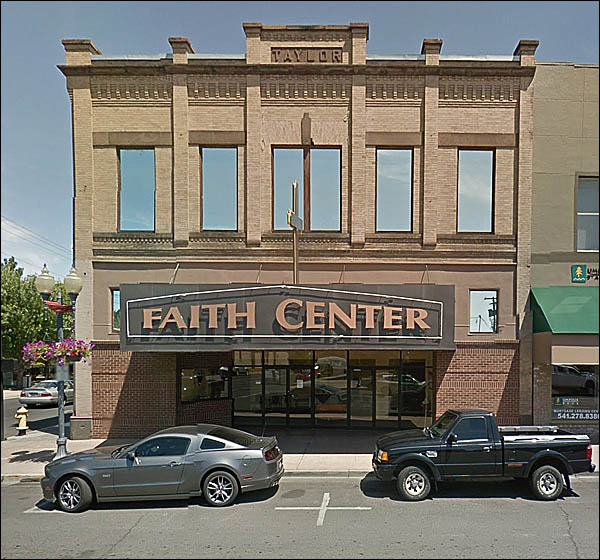
Looks like it was a theater for a while, doesn't it? Not built as one, but turned into one.
I don't know, maybe it's the marquee.
The city's historical website:
Thomas C. Taylor for whom the building is named was proprietor of the Taylor and Brock Hardware Store prominent in the early 1900's and Mayor of Pendleton from 1894 to 1895.
After some googling, confirmation: it was the United Artists Theater. Heck of a marquee.
Preferable to trees, wouldn’t you say?
That’s just the saddest, most woebegone building I’ve seen in years. Someone get it a Kleenex.
Cheer up, it can't be that bad! The Buckaroo Revival awning will be removed some day.
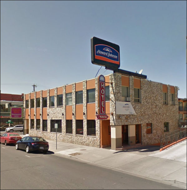
Somehow I think the HoJo nameplate wasn’t original.
The HOTEL sign makes it look ancient. That Faux-Flintstone-effect stone: used correctly, it did bring an au courant look to a storefront, but it was seldom used correctly, and dates a building horrible.
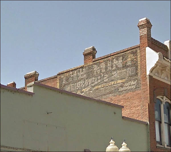
Palimpsest Ghost: you can make out something that looks like a beer ad, and also THE MINT.
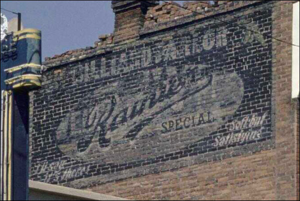
In the corner of the ad, a slogan - soft but satisfying? It’s a slogan used by a bait company since 1934.
I poked around a bit more just now, wondering about that slogan - Here’s an interesting shot from a few years ago, found at Oregon Digital:
It’s a Rainier beer sign. Odd how the old version doesn't have THE MINT - looks older, but apparently not.
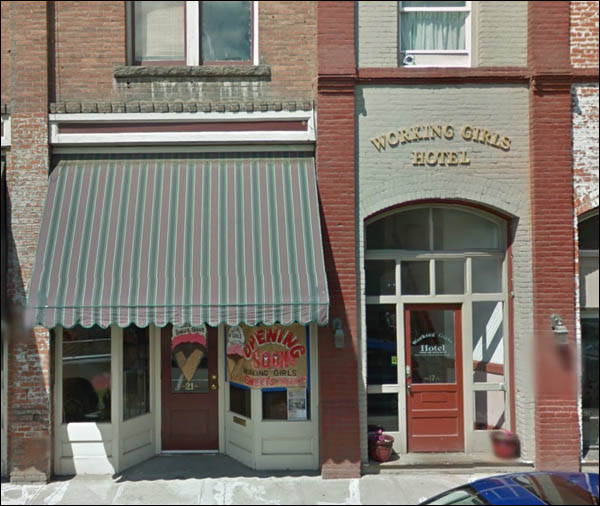
Finally: say, cabbie, where can a fella have a good time in this burg?
|