Snow. It’s welcome; it’s nice. It’s late, but we’ll take it. Knowing we’re past the point when winter seems to have loosened its bony hand from our throat makes one a bit more friendly towards the falling flakes. The tired world is made new and clean.
And the dog likes it:

Did another test shoot for the upcoming Strib video project; we have a three-camera set-up with still cameras shooting HD video. There’s been some problems with sound syncing after 10 minutes, so they just asked me to talk for 15 minutes on anything. So I talked about sound syncing. (And silent movies and “The Artist” and pretty much everything else from Monday’s Bleat, since it was still in my head.) It’s really quite nice to know how long one can hold forth on something without completely falling apart and babbling, and the secret seems to be “no audience.” So when this show is finally ramped up and going, I think I’ll request that they don’t post it.
One of the movies I watched this weekend was “The Friends of Eddie Coyle,” a typically depressing 70s movie. Hey, you like this guy? You’ve grown attached to him? We’re going to kill him in an almost offhand fashion and then the movie will go on for a while, then end, and that’s it. Have a nice day. Whip Inflation Now! Mitchum is fantastic. I mention it only for the inadvertent documentary. The Cars of Dedham, Mass:
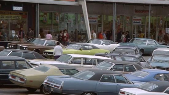
The age of whales. What a dismal sight. It’s a shot in a strip mall parking lot. Love the sign:
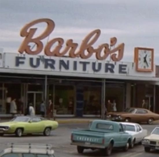
The mall still exists, and the Friendly’s ice cream (to the left of Barbo's in the original shot) is still around, but everything else was modernized. Friendly’s - which I experienced for the first time when I was in New Hampshire last month - declared bankruptcy last year and closed 60+ stores. This article notes that “Restaurants have a life cycle, and Friendly’s has hit it,” industry analyst Ron Paul, president of Technomic Inc. in Chicago, recently told the Globe. “I don’t think there is any marketing fix when you are a model of a restaurant that went out of style.”
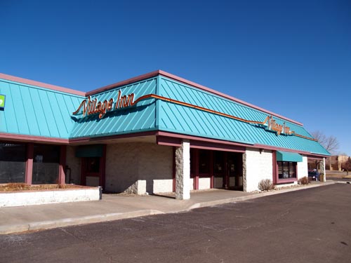
It’s a mysterious thing, going out of style. No one can point to the exact moment when whims changed, tastes shifted, and your name - once synonymous in your peer group with satisfaction and pleasure - turns into an epithet for outmoded, tired, substandard fare. But it is possible to get back in style. It’s not that hard. Take this place.
Village Inn, a place I’d never considered visiting, ever, because it looked like a cheap Perkins. It was 70s orange and turquoise (Perkins had been orange, but made a nifty pivot to green just in time.) The style of the places was 70s. Everything about the look said: formula food with all the corners cut. Pancakes that might have been cooked on a griddle, might have been heated with a clothes iron. Crumbly scrambled eggs and incinerated bacon.
(wikipedia photo)
Then they redesigned everything, redid the logo, went with House Industries “Neutra” font for that contemporary vibe with a dash of vague retro. I discovered this when my dad wanted to go there. But it seems they can’t stop messing up the new clean design.
The new logo:
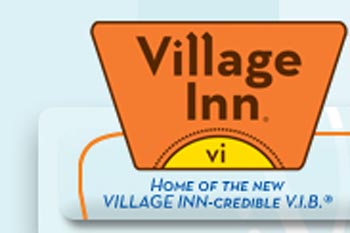
There’s no need for that “vi.” Let the sun be the sun. As for “home of the new VILLAGE INN-credible V.I.B.)” - please. No.
Look at this logo: tell me what the hell that’s supposed to mean.
The Village INN-credible V.I.B.? Very Important Breakfast? Village Inn Breakfast? Are you seriously expecting anyone to think about the VillageINN-credible Village Inn Breakfast? The logo is a nod to the old Hoover logos, I think, but it’s rather busy. The designer was probably instructed to get all that stuff in one logo, which might explain why it trails off into incoherence.
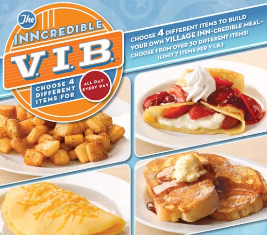
“Choose 4 Different Items For"
For what? For breakfast? For $2.99? For seniors? For great justice? And we can choose 4 different items, with a limit of seven? Eh?
The chain’s had problems, too - this story reiterates the idea that high gas prices helped start the great crash, or at least exacerbate it. Anyway, here’s how it works: I’ll never go a Friendly’s again if I have another choice, because the interior had a weary 1890s Olde Tyme Ice Creamery vibe, the place felt unswept, and the pancakes were too big. One experience poisons your opinion of the entire chain. I would go to Village Inn, because they decided to embrace their 1958 roots, however haphazard the execution, and the breakfast was pretty good. That’s correct: I have a better attitude about one place because of its font choices. But everyone has their own intangibles, and when all these intangibles coalesce into one great formless opinion that trends south, the chain is doomed.
Anyway, that’s what came to mind when I paused "The Friends of Eddie Coyle" to take that screen shot. More or less.
Speaking of design: I had to take screenshots of these pages, because they seemed to sum up website design that makes reading the internets a weary chore.
Correct:
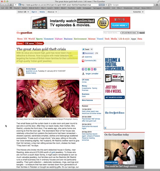
See the yellow? That’s what I came to read. There it is. Ta-da. The Guardian navigation-scheme is a few years old, but it still works.
Wrong:
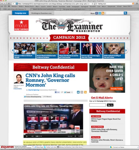
See the yellow? That’s where the story begins. Don’t give your audience 20 things to ignore. Tabs on top! Social media buttons on top! Social media buttons in the story! Big masthead! Subsection banner! A story carousel! Big standing heds! Big headlines! Big Video! Big big big and LOTS MORE BIG BIG BIG. Sign up! Log in! Toolbar at the bottom with more social meda buttons! MEEEEEBO!
It's like opening a newspaper and a boxing glove mounted on a spring boings out and punches you in the nose.