Last week I paid an evening visit to Target with my daughter, an enjoyable errand for both of us. I was surprised by this when I walked in:
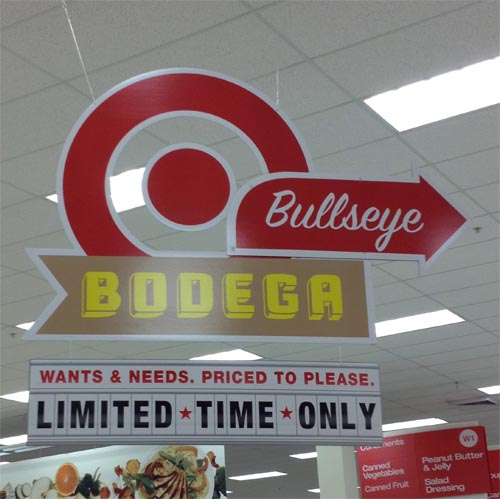
It’s the Cuba font, and the script is SignPainter.
The script doesn’t go with the BODEGA. The latter is supposed to be a 1940s / 50s wall paint in a poor area where all signage is amateur, and the script is the look of a professional sign painter. If you had access to one you wouldn’t need the other.
Anyway: “That’s the Cuba font,” I said to my daughter when we entered. "And Sign Painter."
“Wow Dad,” she said. Unimpressed. This happens a lot. It’s like living with a birdwatcher, I suppose. There’s a cardinal! Uh huh. I explained this to someone else a day later, and the person nodded and said I had a point about the fonts giving a conflicted message, and he said “that might be true, but no one cares.” He was probably right. These messages are probably lost on people, because the typestyles are just seen as RETRO or VINTAGE, and within that grouping everything belongs, right One big happy. Yet this would be wrong:
And people would know it was wrong, because Western does not belong with 18th Century. So some distinctions still work. But the details of the distinctions inside of the genres fade, and we’re all a little dumber for it. There will come a time when most people have no first-hand knowledge of the lost art of grocery store window signage, for example: modern grocery store windows are no longer covered with large paper signs with hand-drawn messages. I’d forgotten all about them. The script was the same wherever you went; people learned how to make those signs, and stores had a guy who could do them, and every few days a new sign was taped up in the window.
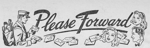
Every so often I find stuff that was intended for a site of its own, but just didn’t make the cut: not enough material, not very interesting, and so on. This is Orphaned Site Week, then - every day, some cast-off material. Today: Forward This!
It’s a pen-pals column from a late 1940s magazine. Mrs. Simpson was the imaginary lady who selected the requests of these lonely folk. And they were lonely. The popular kids didn’t send letters to strangers asking for letters from strangers. I wonder if this was regarded as controversial:
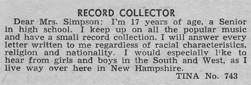
If Hollywood made a movie about Tina any time in the last 30 years, there would be a brutish father, either drunk or deeply religious, who took a belt to her because she was trollin’ for darkies. But it’s possible - isn’t it - that her request was no big deal? It’s a general interest magazine, after all.
Allie is lonesome at night in the country. She will answer all and send a picture:
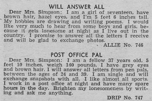
Post Office Pal might have gotten more letters if he hadn’t self-identified as a drip.
Welder seeks same:
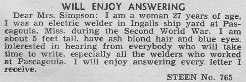
The shipyard still exists - they do work for the Navy, but also built the only American cruise ship launched in the last half century. Well, they started to. It was a project funded by the government, if you can believe that: a 1997 act to rebuild the American commercial cruise-line-building industry. Federal money went to build the Pride of America, but the company that partnered with the gummint went bankrupt, and the ship was never finished. It was towed to Germany, completed, sold to NCL. Butt-ugly thing, it was.
Speaking of cruise ships: I’ve had this for about 25 years. Bought it at a flea market. Never knew what the C stood for, after I found out it wasn’t Cunard.
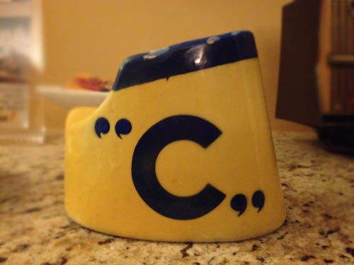
I do now.
This one reads like the rest, until you get to that word:
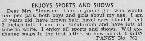
To modern eyes, it’s the second-cousin of ASYLUM, right? Something’s wrong with that gal if she’s in one of those places. Meant she had TB, probably.
Today: There’s a COMIC SINS, and there’s a little surprise from an old friend: I found a 1923 cereal ad featuring Jerry on the Job, HERE. See you around!